Catalog request can be submitted through email or over the phone. Send your requests to jamie@baughenterprises.com. If you are in the area you can stop by our offices and pick up a catalog. We also have online searchable versions of our catalogs. View our Promo Products Catalog or our Clothing & Accessories Catalog for ideas on your next promo campaign.
We have compiled a list of free resouces including royalty free art and fonts for your convenience. From choosing the perfect typography and finding the right visual assets can make your work shine. View our Resources page for design ideas and more.
That depends on your project: invitations are usually A6 or A7, Note cards are A2, standard bussiness envelopes are #10 and #9 replys. View our Resources page for a complete list of envelope sizes and information.
Quote can be submitted by phone or email. Quote requests should contain as much information as possible. The more detail you provide, the faster we can respond with information and pricing. Contact us at 812-334-8189 or by email at jamie@baughenterprises.com, for Bulk Mail quotes contact Mark Leggio directly at Mark@baughenterprises.com. A Baugh Enterprises representative will be in touch within 24 hours, or next business day on weekends.
We accept several application types, below is a list of our preferred Applications. For best results, please submit the source files (the original files from the program it was created in) with a PDF of your final version. We use the latest version of the Adobe Creative Suite on a PC. For most promotional products, vector artwork is preferred.
Acceptable File Formats: For quality printing, please provide vector art and/or rasterized art which is 300 dpi at the finished printed size in the following formats: .tif (high resolution only/not compressed) .eps or .ai, .jpg (high resolution only/not compressed) and .pdf. Other formats not listed may still be accepted contact us for more information.
 How should I prepare my artwork?
Multiple revisions can be costly, make sure your files are ready to print. Be sure to "preflight" your files for color, fonts, and file resolution.
Note: Most files from the web are too small to print properly, please submit your art at the highest possible dpi; 300 dpi at actual printing size recommended for best results.
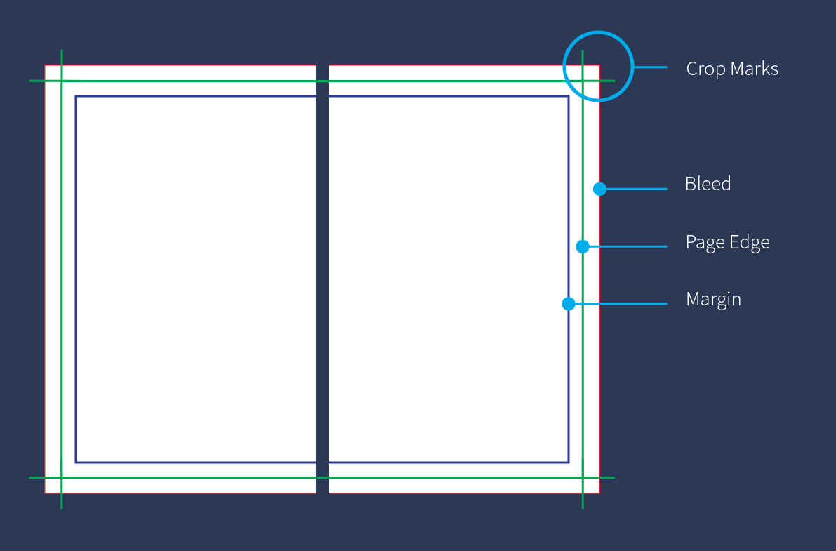
Follow these steps to create a text safe area in your file. In an open InDesign document, on the top left of the bar, go to: Layout > Margins & Columns
Add a 0.25 inch margin, this is the “Text Safe Area,” no important information should pass this line. This insures text and other important information does not get cut off.
Bleed – when a design extends past the “page edge” or “trim mark,” so there’s no chance of white borders after cutting a printed piece.
Trim mark or page edge – indicate the final size after a printed piece has been cut down. Trim marks accompany crop marks showing where the piece should be cut.
Margin or safety area – anything inside your margin is considered in the safe zone of your printed piece and doesn’t run the risk of being cut off, e.g. your copy or any important content.
 Typography
Serif – a small stroke at the beginning and end of the main strokes of a character. Some common serif fonts are Times New Roman, Book Antiqua, and Georgia.
Slab serif – very bold, thick, square-cut serif letters. Sony, Honda, Volvo, and IBM are all great examples of slab serif logos.
Sans serif – meaning without serif, or without any strokes to the end of a character. Some popular sans serif fonts include Arial, Helvetica, and Verdana.
Script – a flowing, cursive stroke imitating handwriting, typically used in design and print pieces as opposed to body text.
Kerning – refers to the spacing between pairs of letters in the same word. Not all letters are created equal, so certain pairs of letters can appear to form an entirely different letter.
Leading (pronounced “ledding”) – refers to the space between two lines in a block of text.
 Color Theory
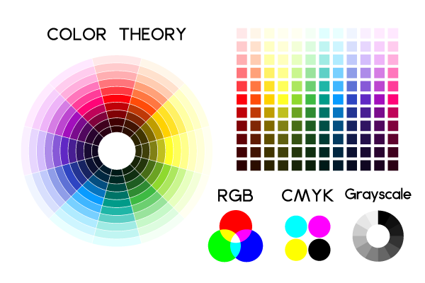
RGB vs. CMYK –These are color modes for images either on a screen or in print. CMYK stands for cyan, magenta, yellow, and key (black). CMYK is used for printing and is often called four-color process or four-color printing. RGB stands for red, green and blue, the three colors of light typically used to display images on a digital screen, like a monitor, TV, or a computer. Keep in mind, if artwork is created in RGB, it might look great on screen however it will print out a different color in CMYK!
Monochromatic – a monochromatic color palette uses various shades of a single color (like a single slice of the color pie in the chart above).
Complementary – colors that are across from each other on the color wheel (e.g. purple and yellow). While complementary colors might be a bit jarring together, this can be used to an advantage when you need a visual element to really stand out.
Most files we recieve are sent through email but we accept files in a number of ways, see the list below.
We recommend compression .zip when sending large or mutiple files. File compression protects the integrity of your files and speeds transmission. If multiple files are to be sent you may place them into a single folder before compression.
Need More Information?
WE'RE HERE TO HELP! If you need any help preparing or submitting your artwork, please contact our resident graphic designer Jamie at 812-334-8189 ext. 100 or by email at jamie@baughenterprises.com. She can talk you through the steps, give you advice and instructions or prepare your files for you.